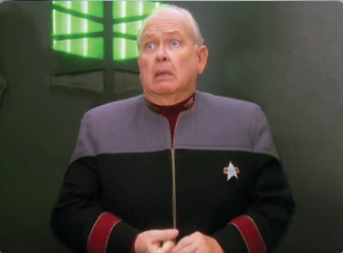
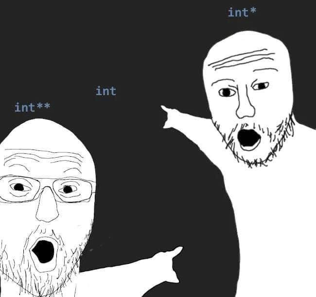
How dare I polish and remove kludges from previous releases. 😆
Also, none of those kludges would have even been necessary if the project scope was properly defined from the start and the project manager didn’t let the users keep trickling in new requirements without also extending the deadline.
So yeah, how dare I go back and implement something the way it should have been done the first time?
So. How long have you worked for Google? Not in years; in chat apps.
What’s the difference?
A year lasts longer
Yeah, I’m sure that almost all of us have felt this way at one time or another. But the thing is, every team behind every moronic, bone-headed interface “update” that you’ve ever hated also sees themselves in the programmer’s position in this meme.
Oh for sure.
The meme is just a very exaggerated tale of moving a tacked-on, added-at-the-absolute-last second button from the previous release into the action menu where it should have gone originally. It’s an in-house application, and the people that complained are also the type that will bold an entire page because “it’s important”. lol
There is a dangerously large population of devs and managers that look at themselves, unironically, as the gigachads pumping out ui “upgrades”
Many of these fail to realize how disruptive it is. UI change is like API breakage for the brain.
I have lost track of how many times I’ve tried to help an elderly family member with an app after some pointless, trivial, ui change. Only ending with them entirely giving up on using the app after the “upgrade” because the cognitive overhead of the change is beyond the skill that can fairly be expected for them 💔
Nice try Microsoft, I still don’t like your monthly “small” ui changes that hide the features I use and add extra “get copilot now” buttons
Nice try Microsoft
That’s the most insulting thing anyone has ever said to me. 😆
My bad, what linux distro you running?
Debian 🤘
Debian Stable?
Yep, though “Debian Stable” is a bit redundant lol.
What’s with Debian Sid?
Its for testing


