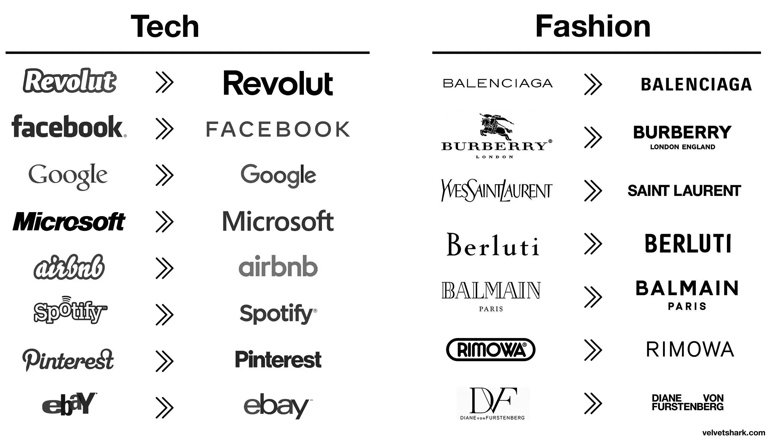
“We’re a tech company now!” logo
They’re trying to impress investors with ‘serious’ design, not stand out with a unique one
Nothing says “serious” like mixing upper and lower case letters yet keeping them all the same height, so it looks like a third grader wrote it
Yeah, it DOES look like shit, but tiger-less and safe shit
It takes a heroic amount of cocaine to make something so devoid of taste and see it through.
Spotify and EBay made the right choices here, the new logos are way better.
Those old fashion logos are actually sick. Concerning that an industry that sells style would make these their logos.
Except eBay, that was always trash.
Better:
- Revolut (though a fintech company named after a revolution lacking the charge at the end is still moronic in several ways)
- airbnb (from awful to meh)
- Spotify (same)
Worse:
- Pinterest (original fit the platform and what it is/was pretty much perfectly. Current is meh)
- eBay (both are bad IMO, but at least the original was bad in a playful and eye-catching way. The new one is just more meh
- Burberry (the stag was notable and signalled a history of old-fashioned quality that’s suitably rugged. The new one is meh AND insecure about people knowing which London they’re from)
- Rimova (yet another fashion brand apparently afraid of being noticed
- DF (from one of the best and most fashion-appropriate logos to an absolute eyesore and kerning nightmare that invites vandalism)
- Jaguar (From absolutely iconic and great in every way to even uglier than the new DF one. I hope whomever came up with that got both fired and beaten and I’m a pacifist.)
The rest just go from meh to slightly different meh 🤷
I liked the old aibnb one.
Microsoft went from “boring with a bit of attitude” to just plain boring
What’s the reasoning behind? Or just a trend?
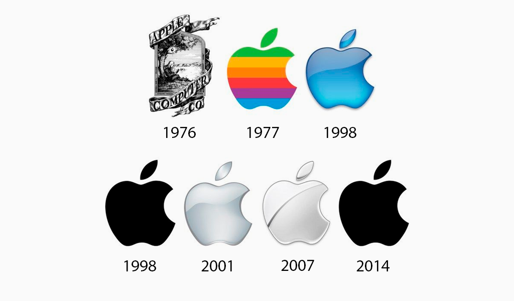
I think it’s just a long-running trend across many different companies towards simplification. Here’s the Apple logo for example:
Changing things for sake of changing things. Like Microsoft with every moronic “update”.
I love how the new logo could be literally done in less than a minute on fucking microsoft office. They didn’t even bother with a cool looking font, just generic curvy shit
I’m sure they spent an unreasonable amount of time getting that ugly font look just right.
Top looks like it belongs on a nice sports car.
Bottom looks like you can find it on a new Multipla.
That font is awful. The G looks completely unrelated to any of the other letters.
The G looks completely unrelated to any of the other letters.
I see this, since half of the letters appear to be uppercase, and the other half lowercase:
JaGUar
Just buy an old style one and replace the new one with it if you just have to have a jag
I fucking hate this minimalist design trend more than it is probably reasonable to hate an aesthetic. It’s got the personality of unfinished drywall.
Honestly I think unfinished drywall has more personality. It’s utilitarian and rough around the edges, without the shiny surface veneer.
That new Jaguar logo is like somebody took a beautiful old house full of exposed brick and wood work and put a coating of white paint over everything.
Soon there will be no color, no originality.
Just a single font to use everything will be homogeneous and consolidated. Minimal, inoffensive and focused grouped to appeal to everyone and also no one.
Movies, music, games, brands.
I would have failed every design class I took in college if I submitted that. Why such wide kerning? Why lower case but upper G? Why so round? Why so completely unreadable at a distance because of micro serifs? There isn’t one good design element in this.
It doesn’t say “car” at all either; no elegance or prestige. The old logo was sexy. New one looks like a logo for bottled water or something.
Edit: it’s like going from James Bond to
Austin PowersInspector GadgetAustin Powers has style. Crazy 60s style but style.

Ya, I wanted to use a bland spy but there aren’t any-- I was going to use the Spy vs Spy guys because they are the most generic-looking, but ultimately I kept Powers because while he is stylish and fun, he is also really immature and the logo looks immature to me.
I think they want people to focus on the “agua” and the j and r are just little accents on it like its word art rather than a logo. Like, I literally picture the marketing weirdos at the meeting going off like this.
The “a” is the worst part for me. You can’t see those little stubbs at a distance. So it reads JoGuor at a distance. They didn’t just fail to create a good logo, they failed to preserve the name. One bit of advice I always give is “imagine this logo on the back of a golf card or a Pride brochure. If the logo isn’t crisp and readable in black and white in a 1/2 inch square then it sucks.” This design fails that test. Not just because of the messed up “a” but the wide spacing makes those unreadable "a"s even smaller than if the letters weren’t so widely spaced.
It’s not joguor?
That looks like marketing, let their six-year-old design the logo. Half the letters or lowercase and half are uppercase.
/uj Technically this is their new logo:
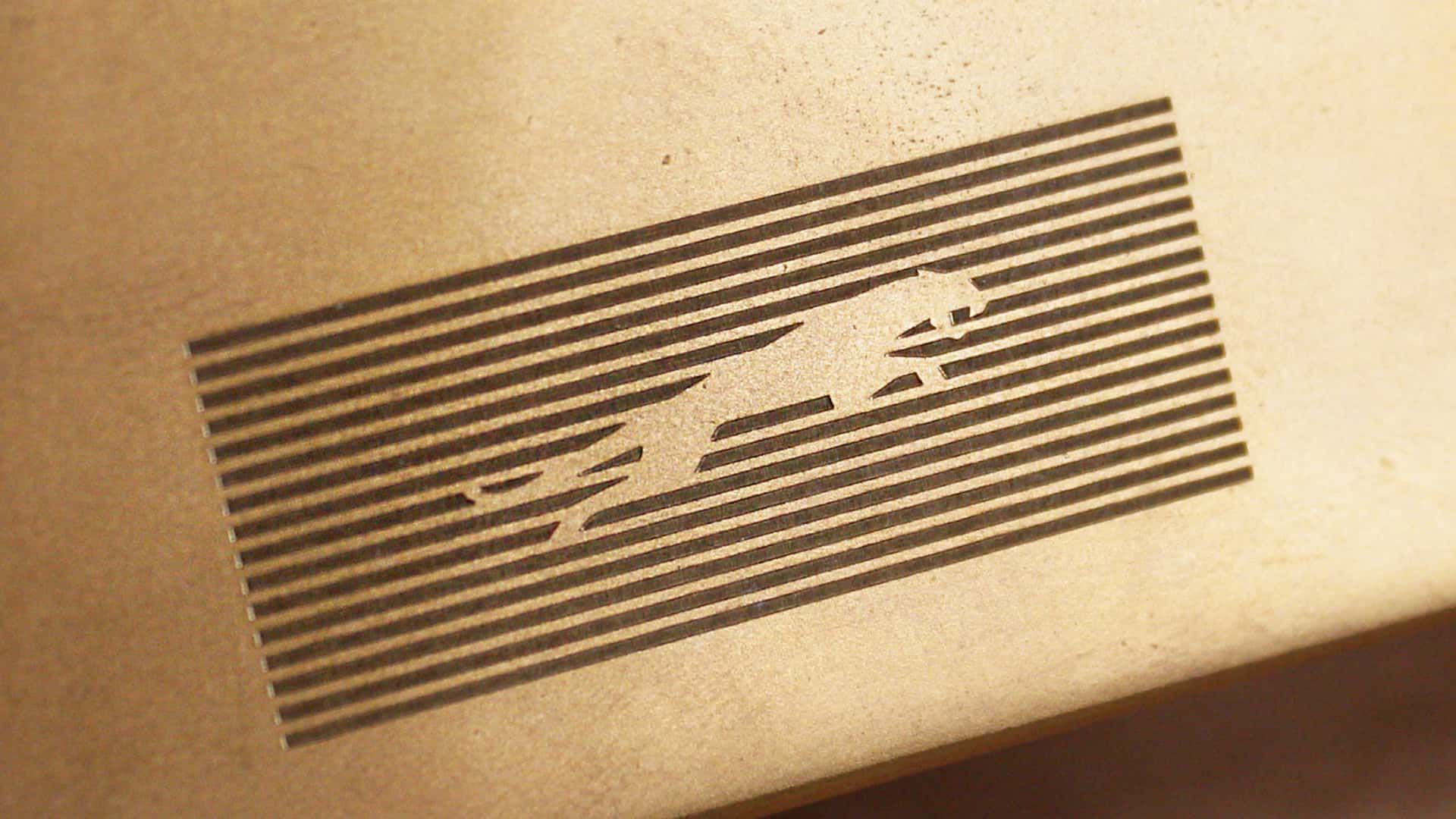
J a G U a r is just their new typeface (I think that’s the name?); and apparently/allegedly is to make the pronunciation closer to UK English, rather than American.
Either way, though - it’s still…
/j
…pReTtY fArKiN’ sToOoPiD.
You spell stoopid with three O"s. Maybe your the stoopid,
Yeah that’s pretty dummb
I would have guessed that was a Puma logo.
Slazenger
Somewhere in Jaguar HQ, a marketing firm convinced the CxO suite that the most pressing problem facing the company was that the logo was wrong. So, in the interests of the shareholders they write off the goodwill value of the existing brand and dump millions of euro into this.
Hah don’t worry, the existing brand is utterly fucked now. One of the worst, most unreliable and badly made cars on the market
One of the worst, most unreliable and badly made cars on the market
But enough about Tesla.
Everyone circlejerks about this online but every IRL owner I’ve actually spoken to say it’s the best car they’ve ever owned.
Yeah, because who wouldn’t want to drive a car from a company whose quality control policy is “don’t” that does welding like this?
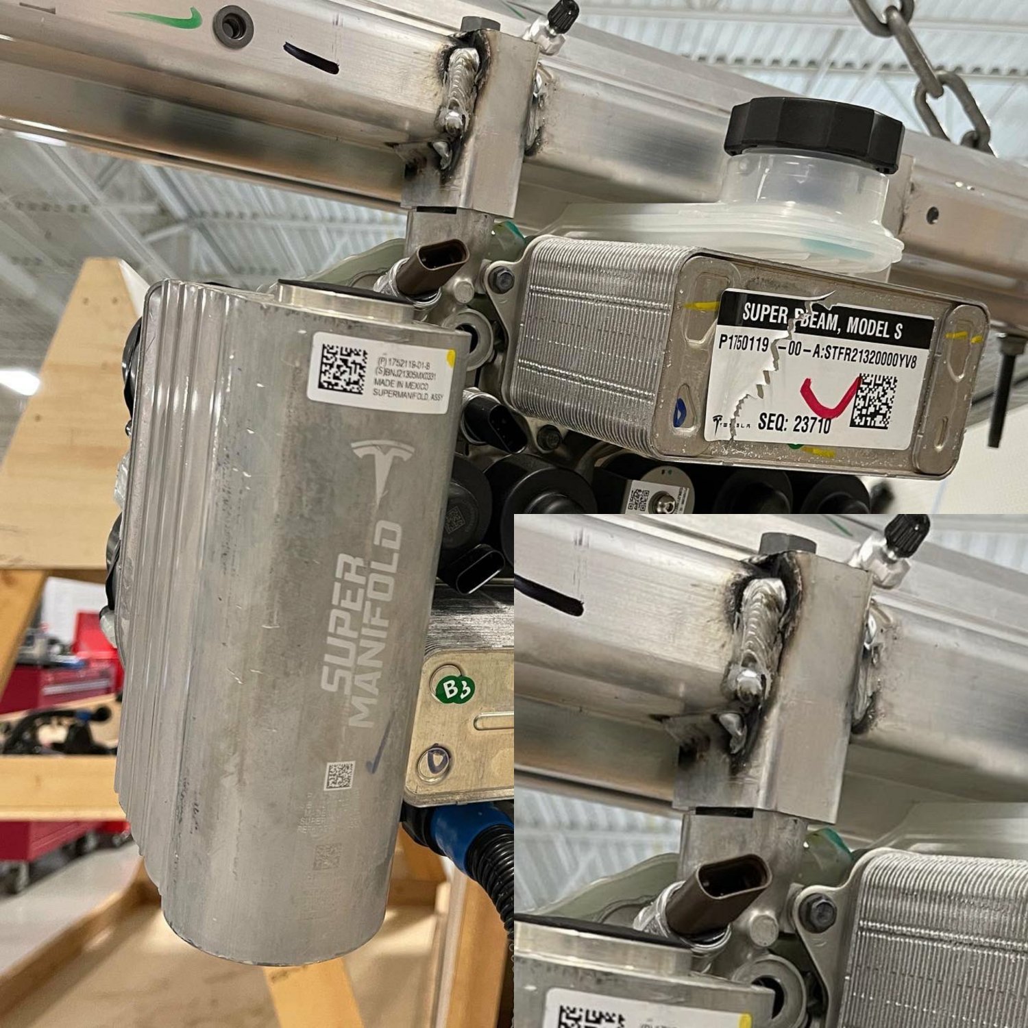
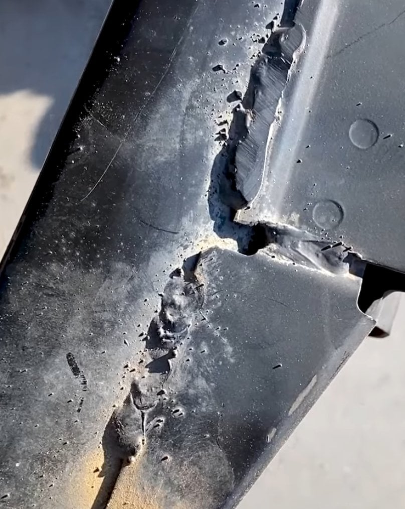
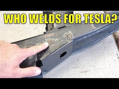
And fit things together this well
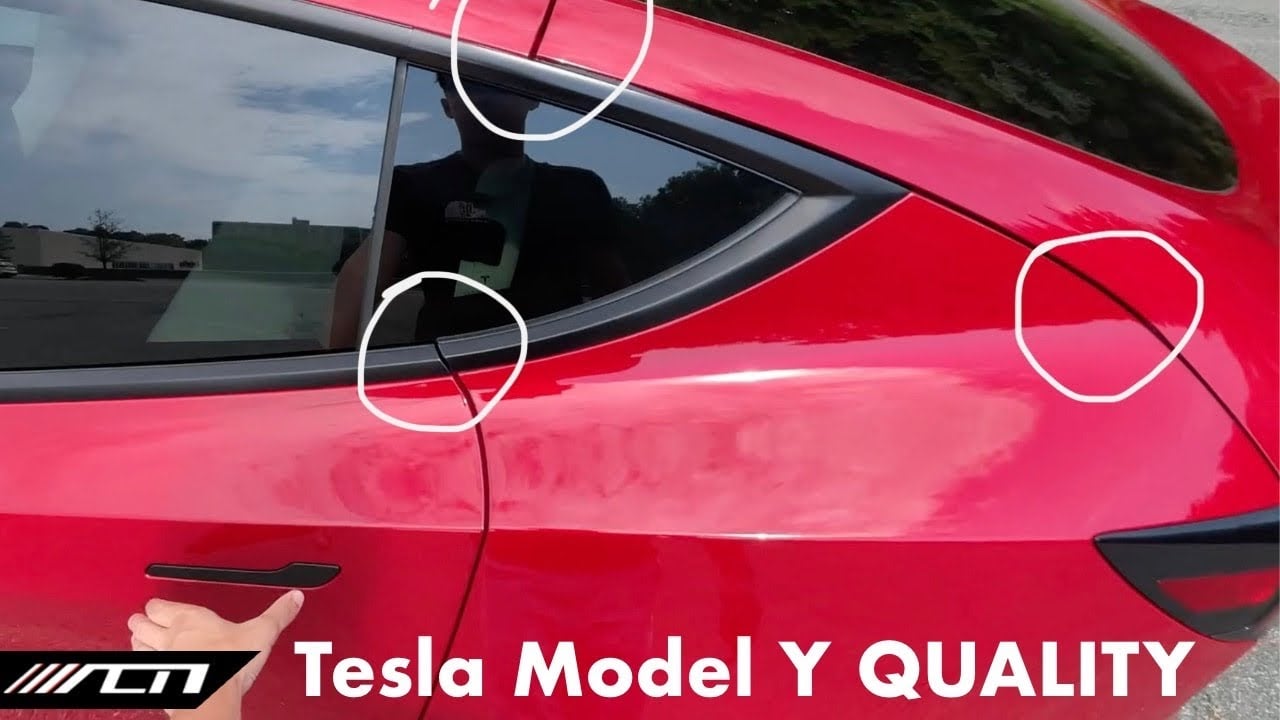
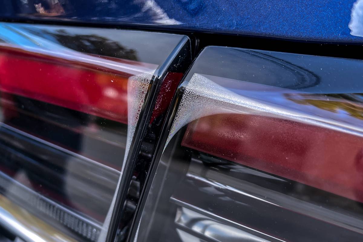
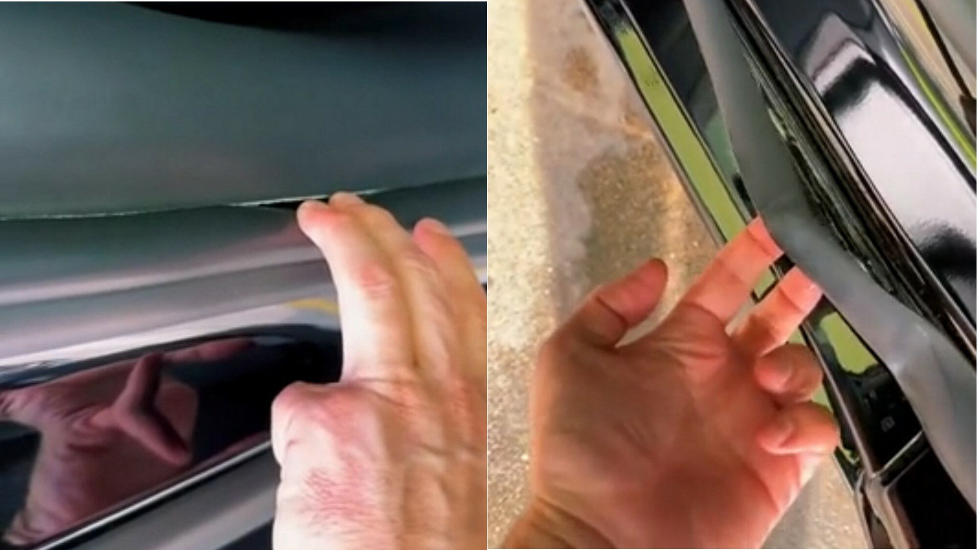
It may be quick and pretty to look at if you don’t inspect it closely, but it has the price tag of a brand new Aston Martin and the build quality of an 80s Yugo.
