
Welcome to 2013, Apple fans! Maybe in 5 more years you’ll get home screen widgets.
Welcome to 2013, Apple fans! Maybe in 5 more years you’ll get home screen widgets.
We actually do have home screen widgets, as of like 2020. They got it sometime before I had my iPhone. And an app drawer!
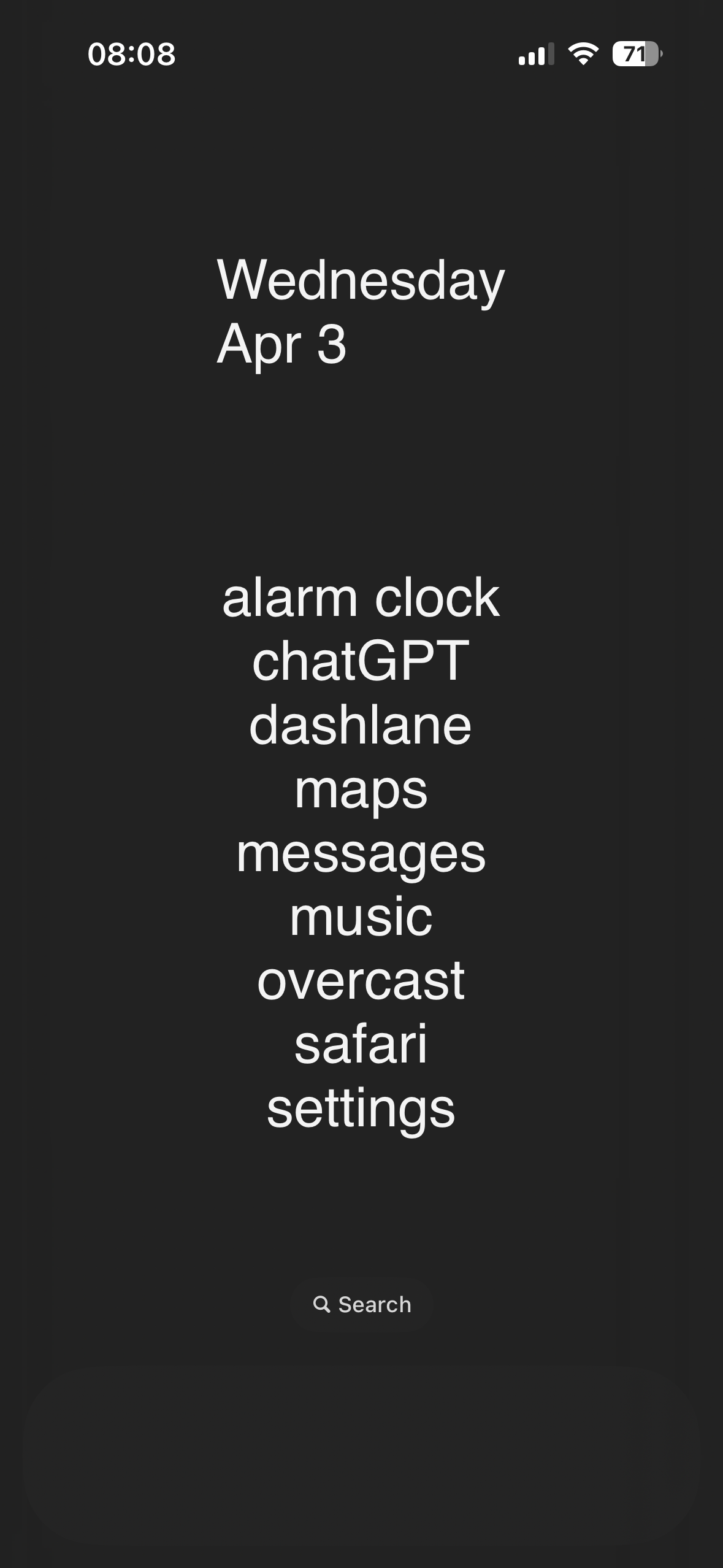
As a former Android user, my iPhone home screen looks wildly different from people who’ve had iPhones for many years. I have very few icons on my home screen, I have widgets taking up most of the top of the screen to push the icons I do have down near my fingers (because Springboard is still stupid as of iOS 17, as this gif is pointing out), I have more widgets to the left (“Today View,” Apple calls this, it’s basically just a scrolling widget section), and then the app drawer equivalent to the right (which Apple calls “App Library”). It’s clean and beautiful and reminiscent of my lovely Nova launcher setup I had on my beloved OnePlus 7T Pro (may it rest in peace).
Whereas most longtime iPhone users just have page after page after page of apps and folders. Every app they own is on there somewhere. Which is ridiculous since on iOS you can just swipe down, type the first few letters of the app, and there it is.
Before the app library existed you just had to have all the apps on a page and could not hide them. I ended up having like 20 page of apps. I eventually cleaned things up and have a page with apps I use, another page of widgets I use, and that’s it. But it took me years before I thought to do that.
Oh I know, it was madness. I briefly had a used iPhone 3GS and then was pure Android until 2022 when I got an iPhone. By the time I came back it was customizable enough that I could make it look like Android, but that’s work for someone who lived with the terrible setup it originally had. I don’t blame existing iPhone users, it’s just something I’ve noticed.
It’s funny, I’ve had an Android, a Nokia Windows Phone, and an iPhone, and Windows Phone was the only OS in which I didn’t open every single app through search. The utter lack of an app ecosystem definitely played a part, but I honestly don’t think either of the other two handle home screens/“app drawers” very well. Every modern social media platform/messenger/etc. is built around vertical continuous scrolling because it’s easier. Why is horizontal, paginated scrolling the default for home screens?
That’s a good point. Now that you mention it, I would much rather my Home Screen scroll down and I can add as many apps and widgets as I want.
The current iPhone page feels a bit claustrophobic now. Thanks.
We had them before that but they were different and not a lot of stuff made use of them
Always about 7 years behind android. Smh
“Pay more for less!” - Tim Apple
Thanks trump
I know, right? It also took them years to improve their notifications to work like Android’s (still aren’t quite as good). And I STILL can’t do what this gif is showing because iOS 18 isn’t out.
I remember having this feature on my jailbroken iPhone in like 2009. Wild that it took this long.
iOS already has widgets?
This interaction is so indicative of the reality of device fandom.
The Android user isn’t storing information about the iPhone in their brain.
The iPhone user is responding like everybody knows everything about iPhone features and it was dumb of the android user to not know this thing.
2013? Pretty sure you could do this on Android waaaay before that.
My first Android was an HTC Hero, which was released in ~ October of 2009.
One of the first things I did was swap the location of the Maps and Store icons to make it easier to reach on the edge of the phone.
I recall people complaining that same year that the iPhone 1 couldn’t copy or paste text.
:)
I’m not sure about iPhones, but iPads have had homescreen widgets for a whole year, maybe even two!
Welcome to 2024, Apple hater! All the things you bash Apple for already exist, but you’re so blind you can’t take 5 minutes to do some homework about it. This whole thread is about icons not snapping to a grid, imagine being so petty you have to bring out the full hatred for something so meaningless. I’ve never once heard an Apple fan flame android OS like this
Bro, you can’t be for real, can you? Apple fans have been shitting on Android non-stop since it was created.
This is an April Fools, right?
No way a fancy top end smartphone in 2024 doesn’t have this extremely basic feature from over a decade ago that everything has…
You would think that. But as a person having an iPhone… No it is not. At least the part of iPhones currently not having that option. App-Icons on your “desktop” will always align in dense rows from top left to bottom right, with no free spaces allowed.
It is a bit weird, and I don’t really see why, since you can change the order of icons in this dense row-grid. I am glad Apple warms up to the fact that people might actually want some kind of customization on their devices and not everything “the way Apple decrees it”.
But to be really honest… I did not even notice prior to this post, and I had all Android before switching to my current iPhone. So at least for me this is a really small non-issue, and maybe a nice-to-have feature.
I had an iPad for a while and it definitely bothered me. Really just about everything did. It felt like I had to fight with it to do just about anything I wanted to do.
Ahh Apple, the first to introduce what Android users have simply taken for granted
iPhone just feels so unintuitive after using Android. Their UI absolutely sucks in my opinion.
When everything = one of two.
It can
This is what my homescreen looks like and apple’s struggling with placement of icons?

unixporn material.
You’ve taken “home screen as self expression” to a new level
level 70and I am here for it.that is 🔥 ! how though?
Total launcher. Had to design whole thing though. The theme is based on nier: automata game ui.
I immediately recognised the game UI - well done!
Holy fuck why is that so beautiful. You’ve unlocked something in me I didn’t know was there and must pursue now.
What sort of gameboy is this?
Beautiful homescreen from a beautiful place
Ahhhh config please…
It’s not klwp. I made it in total launcher.
Is there some form of backup thing to export config?
Gimmi those viruses!
Yeah because oc is going to find some exploit from the config file, inject it to the backup and then send it to some random guy on internet
If you look at his instructions, he says “Take general internet safety precautions and don’t open zip files from strangers without checking.”. I was making a joke that IDC and I want the theme. I can see why that didn’t really come through if you didn’t actually click his link, given the short nature of my reply.
Ah gotcha. I tought I missed something😂
You forgot me…
RIP in peace Windows Phone 10. Still the best home screen setup ever.
Say what you will about Microsoft, lemmys, but Windows Phone 10 had great performance and battery life. It’s a shame that it was nuked because MS couldn’t bring themselves to go all the way on the Android bridge.
I’m a mobile developer and back around 2011 I was hoping like hell that Windows Phone would make it big. When you look at Xcode (for iOS), Eclipse (for Android and Blackberry) and MS Visual Studio (for Windows Mobile and Windows Phone) for mobile development, there was absolutely no comparison - it was Visual Studio all the fucking way. But Microsoft just decided to completely shit the bed and give up on mobile altogether. I still don’t get it.
Around that time WebOS (under Palm) had the Mojo SDK, it was pretty slick.
I’ve heard nothing but good things about WebOS but I never got the chance to try it out.
I loved it, it’s a shame that phone failed to find it’s market. Luckily Matias Duarte eventually incorporated the best parts into android. Swipe navigation is almost identical to webos
They also messed up Nokia before killing Windows Phone. Nokia’s Symbian used to be a serious competition to android.
Symbian was a fantastic OS, but it never competed with Android in any meaningful way. Nokia was already circling the drain when Microsoft bought them and first Windows phones (Lumias) were fucking awesome. And then fucking moron Nadella killed Windows Phone.
The Windows Lumina phone was a battery-draining buggy version with a smaller screen than the Linux version N9, When they turned that into Windows (Lumina 800), they had to use a smaller screen and less memory as Windows couldn’t handle the hardware as MeeGo could.
N9 was perfect in every way except that it was abandoned. I miss that phone every day I use Android
Yet, that is the real Linux phone killer move by the former, Microsoft CEO for Nokia. Also the move that killed Nokia phones.
When Microsoft bought Nokia, Steve Balmer (ex-Microsoft) was at Nokia helm. His work with Nokia was so much in the interest of Microsoft that he was rewarded with head chair of Microsoft not much time later.
You mean Elop? Ballmer was MS CEO when MS bought Nokia, but they were doing fairly well in the beginning. Fucking moron Nadella took over and killed Windows mobile. Despite publically admitting later that it was a mistake, he’s still a fucking moron.
And MeeGo as well, which was a more modern base and even better UX than Windows Mobile in my opinion.
Nokia’s Symbian was shit and you’re the only person I’ve ever heard saying anything positive about it. To be a serious competitor to Android or IOS you need to have as much apps on the store and Symbian had very few.
I am saying that it was probably sabotaged by Microsoft leaning leadership at Nokia.
Also, despite being Linux core, Android itself was shit in the beginning. Gingerbread (G) was the first edition that won favour with buyers. Hardly any takers of android for its first six versions (A to F). Not even the techy nerds were buying Eclairs.
Around 20 years ago, iOS used to outclass everything by a big margin. Android, Nokia/Symbian, RIM, etc were closer to each other than to Apple. And now …
As of 2024, fresh competition to android is needed.
Honestly windows phone was sabotaged by both 3rd party developers who refused to port their apps to the platform, despite how easy it became AND did things like kill their own APIs to stop other developers from developing ports themselves, as well as by Google by not allowing their services on the platform.
The hardware was honestly top notch, even compared to my current S21 ultra. They were fairly pro consumer, having removable batteries, SD card slots and a 3.5mm jack right up until the end, even after the other big manufacturers removed them. And after the major update (the WP 8.1 update iirc) the software was really nice, intutive and pretty. I miss arranging and resising tiles, I miss having my pictures or album artworks showing up on the homescreen and I still use the Microsoft launcher on android to get the app drawer like I had on my WP.
Windows Phone was mostly sabotaged by first-party developers. Microsoft has a history of abandoning their mobile phone OSes after very short periods of time and nobody trusted them not to do it again. As a result few app developers bought into the ecosystem and smartphone enthusiasts told their friends not to get Windows phones, causing modest sales, causing Microsoft to immediately drop the platform.
As everyone expected them to.
What launcher are you using currently? I have Launcher 10 but I’m always looking for a new WP10 styled one to use
Yes, it was a shame, and it only died mainly due to the lack of available apps in the store and bad management. MS took too long to release it with Android and iOS already well established in the market… It was also the OS that resisted the longest in the Pwn2Own Hacking Contest in these years. While Android and iOS went down in less than a minute, before the hackers could access the data, on WindowsPhone they hit their teeth on a rock, after half an hour they could only access the cookies.
Microsoft fucked up in the smartphone market so many different ways. The misunderstood the UX paradigms that would work, refused to change when Apple had obviously stolen their lunch money, stayed the bad course they were on when Android stole Apple’s lunch money and then didn’t even notice it has slammed Microsoft into some lockers because that’s how little windows phone mattered. By the time Microsoft did like… Actual good market research and focus testing to build an actual good mobile os (maximally ironically based on their Zune UX which had failed previously because Microsoft was infinitely too slow to the mobile audio market) it was exactly as you said. The perfect mobile OS just 5 years too late to matter. More than anything what they needed to do was prove the apps you actually needed were present on their store and pay OEMs money to make windows phones to establish market share to make up for having a lower count of apps. They failed to do so. Now their actually genuinely brilliant mobile os only exists as a series of android apps that no one really gives a shit about.
I was always shocked how smooth windows phone was. This system had potential but well.
You can still get it with android launchers. Was toying with them the other day. Launcher 10 I believe is pretty close.
I actually use Launcher 10. I love it minus the weird glitch where the letter selector from the all apps list occasionally not working. Best Android Launcher around
There’s a few android launchers that emulate the metro ui. I use the Square Home one and I have no complaints.
Tbh the default launchers for mobile are garbage. Scrolling around looking for icons on a desktop like environment is not intuitive. Everyone’s home screens just become a junk drawer of every app they’ve ever downloaded.
They can rip Niagara launcher from my cold dead hands I’m never going back to icon panels
Niagara is wonderful. Clean feel and only minor issues. Best one I have used in years
Genuinely the only way I want to use my phone. Everything I use daily is on the home screen, everything else I have to go searching for. White background, black icons, all notifications turned off. Simple and easy!
I can’t seem to find info on it other than a few screenshots on the play store. Do you choose the home screen apps or are they auto-selected?
My launcher of choice right now is KISS which looks similar by default but I can’t tell if they function the same. Anyone tried both KISS and Niagara?
I just installed KISS to check it out, this is really nice too! I think niagara has a couple more bells and whistles, but it also could be I’m unfamiliar.
- sliding across app for quick select actions is missing, haven’t figured out how to access these yet (ie to jump directly into composing an email or text)(See edit 2)
- inline notifications is a big difference standing out for me, I still need to use the notification bar?
- KISS seems very focused on their search bar which is feeling like a bit more typing. I can tap the circle for an app list but it’s on the far side of the phone? (See edit 1)
- Niagara tries to be smart enough to bring apps you’ll want to the front homepage, when youll need it. ie connecting to Bluetooth headphones pushes my Spotify to the top. I know KISS doesn’t know my habits, but it seems simpler based on history of launches.
- niagara relies on more gestures and swipes
- KISS adding contacts to the home screen is a neat approach, people centric design is good
Overall It’s small details though functionallly they seem very close to me. KISS still great and I love it’s FOSS. They’re doing a solid job of a simple, get stuff done launcher. I don’t want to sound like I’m shilling, but Niagara has a free version you could evaluate for yourself
Edit: hmm after digging through the settings I see KISS supports a gesture for opening the app list - however none of the gestures are functional on my s23. Strange…
Edit2: Ah ha! Quick actions are available from the search, and add themselves to the history. I don’t love having visible duplicates but it’s workable.
Thanks for the run down! I saw there’s a free version but didn’t seem too different, so it’s good to get the opinions of a user!
Rather than having to search everything you can have your commonly used apps show in a list on the home screen. Personally I turn this off and have a clean home screen, but pin favorites above the search bar. Tapping the search bar shows the most commonly used apps.
Also I think gestures are not from search results but from the home screen. I use gestures on my blank home screen. I have it set up so a swipe down opens the notification tray, a swipe right opens the camera, swipe left opens search, swipe up opens browser. But this is customizable. Not sure if it works if you have the common apps list showing on the home screen.
I don’t think KISS has smarts like Niagara seems to. Just showing commonly used apps is about as smart as it gets. To my knowledge no notifications on the home screen either, though you can add widgets so maybe that’s solvable in some way.
Anyway, seems they are similar but Niagara is a bit superior with KISS being a bit inferior but FOSS, both good options!
Let me know what you find out, I also use kiss
See the other reply by @CaptDust@sh.itjust.works
Awesome thank you!
You choose the apps. It will also auto-add apps based on usage.
If only the animations weren’t broken for 3rd party launchers…
My Home Screen
Niagra, Lynx, Olauncher(FOSS, previously Sentient launcher), are all very differebt cool usable launchers
Microsoft launcher master race.
microsoft launcher sucks
you suck
Believe it or not: Straight to jailbreak.
There is a tweak, which I don’t recall even having on Android, that lets you select tons of apps and move them around, you know, like you could in a desktop environment… I wonder how much time will take to have that.
(Probably some 3rd party launchers or Android skins allow this, but I can’t do it with Pixel Launcher).
I haven’t seen that in an Android launcher, but there’s nothing stopping it from being implemented. I’ve even seen Windows Mobile inspired launchers with similar widgets and menus on Android
Xiaomi had that last I tried it years ago
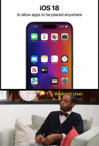
This was not allowed before. Until just recently, the technology didn’t exist to place icons anywhere in the grid. They would automatically smoosh up into orderly rows starting at the top-left with no gaps between icons. Apple is continuing to develop cutting edge innovation, though, and now you will be able to leave entire rows and columns empty, or any specific icon space you choose!
Seems like a trivial programming task even my junior noob ass can handle.
Actually it’s because apps aren’t neutrally buoyant in the OS, they naturally float to the top
No wonder it took so long, must’ve been a nightmare to get every different app neutral, what with their differing weights.
They had to invent whole new algorithms to he able to give the binaries of all apps the exact same Hamming weight
Dear god, someone needs to make a physics based home screen. It would be utter hell. When you move, it all gets tossed around.
Auto rotate works on all angles…
Widgets are now 3d boxes and you have to tilt your phone down and flip it until they face you.
Apple fan boi here.
I also love to shit on Apple.
Some of the big reveals are so dumb. They just give things a different name to blow your mind.
“Omg! They invited spatial computing!!!”
Well this is good news. I never owned an Apple product until my recent purchase of an iPad Mini.
I was nervous about switching from an Android tablet, but everything went great until I tried to move my home screen icons where I wanted them, and resize a weather widget the way I wanted it. Neither worked, and I had to laugh at how ridiculous it was.
I’m very much looking forward to version 18 now.
I’m not sure I understand what we’re talking about. When you install an app on iOS, the icon pops onto the home screen or an adjacent page if there’s no room. Can you not move the icons after that? I know you can put them in folders.
I guess that when you come from a land of tweaking things to juuust the way you like it, any hindrance to this would be annoying
At least on my iPhone (no idea if iPads are different) you can reorder, but the icons will always be “dense” meaning no free spaces between them. They will always align in full rows beginning from top left. You can put stuff in folders, and you can change the order, but not have one icon in the third row, without the first and second row being fully populated with icons.
I had no idea! I guess it’s a minor thing, but that would annoy me. Thank you for explaining.
Are they letting you guys keep your screens on yet? Or is that something that’s being saved for 19? Probably not a big deal for most, but an always on display for time, calendar, and alerts without having to do anything to active my phone is clutch for me. When I see other peoples phones with blank black screens they look so dead.
They have actually introduced AOD, but only from the iPhone 15.
Their reasoning for not backporting the feature (unless phone is charging) is that the older models don’t have LTPO displays that go down to the 1hz they do in AOD on the 15. A stupid reason imo.
Huh? Always on display has been around in iOS for years. Since 2022 with the 14.
That’s like…one, maybe two years
As compared with Android, which is like…decades
It’s been around since 2022. Though I actually turned mine mostly off besides the clock because it’s just unnecessary and distracting the majority of the time. And super unhealthy.
Wouldn’t this drain your battery and cause burn-in on your screen?
Minimal / worth it / non impactful assuming you charge nightly anyway and no.
It does take more battery than just a blank screen, but it is kept extremely dim and automatically changes placement on the screen every so often so it doesn’t burn in. Also, if it doesn’t detect light (like if it were in your pocket) it turns off. I havent done the math, but i think playing a game on your phone for like 30 minutes would probably drain the battery a similar amount to a whole day if this display
Fucking weird comment
Just use the little arrows next time mate.
Fucking weird comment
im stealing this for the next rational and highly upvoted comment i see
Well damn, guess I’ll switch over now.
That was the last thing holding you back? No criticism, just genuinely curious.
I am extremely confident it was joke
In retrospect, you’re definitely right lol
As an iPhone bitch, I still found it funny hahaha
…I thought we all just stopped having apps the Home Screen when we could put them in the library and unclutter everything.
That’s what I do. My home screen only has the time and weather on it. The next two screens have folders.
Thank you, I thought I was nuts for a minute.
I mean you still could be. I’m not a professional.
Yeah I have almost no apps on my Home Screen. Just one page of widgets, and 3 pinned to the bottom.
Otherwise if I want an app I just use spotlight. Quick swipe down and the first letter or 2 of any app and I’m in. I almost never touch the App Library.
This prob comes from using spotlight so much on Mac as well though.
I hadn’t considered the connection, but now that you mention it I use Spotlight pretty much exclusively on my Mac too. Hopefully they don’t mess that feature up in the future or I’m going to have to learn how to manually organize things.
deleted by creator
lol yeah I literally use Spotlight for everything, it’s way faster the majority of the time.
You’ve just moved the same problem somewhere else if you do that.
I run a “main” home screen with Clock, Calendar, Weather and Alerts, then the next one is apps I commonly use, separated into folders, tools, photography, entertainment, comms, MFA, and then the next screen is my email.
To be fair, as both an iOS and Android user, the way android moves icons around drives me crazy , I much prefer the iOS “shift everything down” approach
Isn’t that launcher dependent?
Not sure, I have a Pixel and use the stock everything
Glad I’m on iPhone where I don’t have to worry about “launchers” and everything works out of the box.
Androids work out of the box too. The point is if you don’t like the way it works you can find alternatives. If you like stock iPhone that’s fine but I find it claustrophobic.
Ignorance. The mark of a true apple cult follower.
Happy because no choice. Android works pretty well with default one but lauchers helps to overthrow what oem gives
You’re talking to a bunch of geeks. There’s nothing wrong with the default pixel launcher. I used it for years. Most of these people have a butt ugly home screen and all kinds of ridiculous customizations that no one else has time for.
I cannot refute any of this.
Well… There’s yer problem
Ugh, I would not even use Android if I could not root…
I see what you mean, and this could be easily fixable with a toggle.
As an exclusively Android user, I couldn’t agree more
Get a new launcher in your life!
I don’t get it, I’m on iOS 17 and can move them around? I came from a pixel and I was surprised that you could. And you can also stack widgets which is nice
The gap/spaced rows are impossible with current technology
They researched it for 3 years
Sounds like it must be some advanced alien tech but I think I’ll be alright without it
Can you leave a space in between two icons though
Is it about maybe allowing blank space between apps?
Reminds me of this https://youtu.be/9BnLbv6QYcA?si=gRyq1w2l4X6HYgC-
Here is an alternative Piped link(s):
https://piped.video/9BnLbv6QYcA?si=gRyq1w2l4X6HYgC-
Piped is a privacy-respecting open-source alternative frontend to YouTube.
I’m open-source; check me out at GitHub.


